Website accessibility helps more customers use your site, reduces risk, and improves the overall experience.
By Rob Campbell
For many Nashville and Middle Tennessee business owners, website accessibility sounds like a legal or technical issue. In reality, it starts with a practical question: can every visitor use your website, understand your content, complete your forms, and contact your business without unnecessary barriers?
1. Define Website Accessibility in Plain English Before You Start Fixing Pages
Website accessibility means your website can be used by people with visual, hearing, motor, cognitive, or other disabilities.
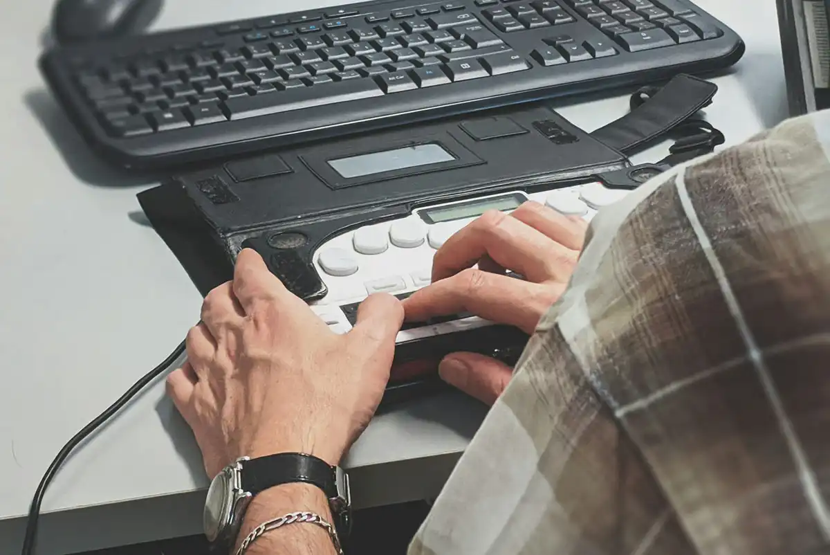
That includes customers who use screen readers, keyboard navigation, captions, zoom tools, voice control, or other assistive technology. It also helps everyday users dealing with temporary issues like a broken mouse, bright sunlight on a phone screen, slow internet, or aging eyesight.
The goal is simple: remove avoidable barriers so more people can do business with you.
2. Use WCAG as Your Practical Checklist, Not Just a Technical Buzzword
WCAG provides a structured way to evaluate accessibility rather than relying on guesswork.
The Web Content Accessibility Guidelines are maintained by the W3C Web Accessibility Initiative and are widely used as the practical standard for accessible web content. WCAG is built around four major principles: content should be perceivable, operable, understandable, and robust.
For a Nashville business owner, that means your website should be easy to see, easy to use, easy to understand, and compatible with assistive technologies. You do not need to memorize every guideline, but you should know that professional accessibility work should be mapped back to WCAG criteria.
If you are evaluating ADA Compliance for your website, WCAG is usually the checklist your developer should be using.
3. Add Meaningful Alt Text So Screen Readers Can Explain Your Images
Alt text should describe an image's purpose for someone who cannot see it.
For example, a photo of your storefront might use alt text like “Front entrance of ABC Dental in Franklin, Tennessee” instead of “building” or “image123.” If the image is decorative and adds no useful information, it may need empty alt text so screen readers can skip it.
The W3C’s image accessibility tutorial explains that text alternatives should reflect what the image communicates or what function it performs. That distinction matters because a team photo, service diagram, logo, and button icon all need different treatment.
Alt text is one of the easiest accessibility improvements to overlook, especially on WordPress sites where images are added over time by multiple users.
4. Make Every Button, Menu, and Form Work Without a Mouse
A visitor should be able to use your website with only a keyboard.
This matters for people who cannot use a mouse, people with vision limitations, and users who rely on assistive technology. The W3C’s keyboard accessibility guidance explains that website functionality should be available from a keyboard.
A simple test is to open your website and press the Tab key. You should be able to move through menus, links, buttons, forms, popups, and checkout steps in a logical order.
If your navigation disappears, your form cannot be submitted, or your call-to-action button is inaccessible, some visitors may be prevented from becoming customers.
5. Use Clear Color Contrast So Text Is Easy to Read for More Visitors
Text should stand out clearly from the background.
Low-contrast design may look subtle, but it can make content difficult to read for people with low vision, color blindness, aging eyesight, or mobile users in bright outdoor conditions. This is common on websites that use light gray text, thin fonts, image backgrounds, or brand colors without enough contrast.
Good accessibility does not mean your site has to look plain. It means design choices should support readability, especially for important content like phone numbers, service descriptions, buttons, pricing details, and contact forms.
For small businesses, contrast problems are often quick wins because they can usually be corrected without rebuilding the entire website.
6. Write Link Text That Tells People Exactly Where They’re Going
Link text should clearly describe the destination or action.
Avoid vague links like “click here,” “learn more,” or “read this” when the surrounding context is not enough. Screen reader users may navigate by jumping through links, so every link should make sense on its own whenever possible.
A better link might say “view our accessibility services” or “schedule a website accessibility audit.” Clear link text improves accessibility, usability, and conversion because visitors understand what will happen before they click.
This is especially important for Nashville-based service businesses, where customers compare providers quickly and need a clear path to the next step.
7. Label Contact Forms So Customers Know What Information to Enter
Every form field should have a clear label that remains understandable to users and assistive technology.
Placeholders in fields are not enough, as they may disappear once someone starts typing. Labels such as “Full Name,” “Email Address,” “Phone Number,” and “Project Details” help users understand what information is required.
Error messages should also be specific. Instead of saying “Invalid entry,” tell the visitor what needs to be corrected, such as “Please enter a valid email address.”
Contact forms are business-critical. If a customer cannot request a quote, book an appointment, or ask a question, accessibility becomes a revenue issue.
8. Provide Captions and Transcripts for Videos, Audio, and Embedded Media
Videos and audio should include text alternatives so more people can access the message.
Captions help visitors who are deaf or hard of hearing, but they also help users watching without sound in an office, restaurant, waiting room, or public space. Transcripts can support people who prefer reading, need assistive technology, or want to scan the information quickly.
This applies to promotional videos, testimonials, training clips, podcast embeds, webinars, and social media videos placed on your website.
If your business uses video to explain services, answer FAQs, or build trust, captions and transcripts make that content more useful to a wider audience.
9. Simplify Navigation for Visitors with Cognitive or Motor Challenges
Navigation should be predictable, consistent, and easy to follow.
Visitors should not have to hunt for your phone number, service pages, location, business hours, or contact form. Menus should use plain language, avoid unnecessary dropdown complexity, and keep important pages within a few clicks.
For users with cognitive disabilities, simple navigation reduces confusion. For users with motor challenges, fewer unnecessary clicks can make the site easier to operate.
Clear navigation also helps buyers move through the decision process, which matters for small and mid-sized businesses competing in Nashville, Franklin, Murfreesboro, and surrounding Middle Tennessee markets.
10. Test Your Website After Every Major Update, Plugin Change, or Redesign
Accessibility should be tested regularly because websites change over time.
A site may launch in good shape, then develop issues after new plugins, theme changes, page builder updates, embedded tools, forms, image uploads, or content edits. This is especially common with WordPress websites where multiple parts of the site are maintained separately.
Basic testing should include keyboard navigation, screen reader checks, form testing, color contrast review, mobile testing, and automated accessibility scans. Automated tools are helpful, but they do not catch everything.
The ADA.gov web accessibility guidance explains that businesses open to the public should make online goods, services, and communications accessible. For most business owners, the practical path is ongoing review, thoughtful fixes, and a maintenance plan that keeps accessibility from slipping after launch.
Build Trust by Showing Customers Your Business Takes Accessibility Seriously
Accessibility signals that your business cares about serving people well.
That trust factor matters. Customers notice when your site is easy to read, simple to navigate, and respectful of different user needs. Accessibility also supports professionalism by showing that your business takes the online customer experience seriously.
This does not mean making unsupported legal promises or claiming “certified compliance” without a proper basis. It means being transparent, maintaining your site responsibly, and working with people who understand the technical details.
At Nashville Web Solutions, we approach ADA Compliance from a practical perspective: audit the site, identify barriers, prioritize fixes, and maintain improvements over time.
Know When DIY Accessibility Fixes Are Enough and When to Ask a Professional
DIY fixes are useful for simple content issues, but technical accessibility problems often need experienced help.
A business owner or marketing assistant can often improve alt text, rewrite unclear link text, simplify page content, and add captions to videos. Those are good first steps.
Professional help becomes more important when the issues involve navigation structure, keyboard traps, form behavior, theme code, plugin conflicts, ARIA labels, modal windows, checkout flows, booking systems, or third-party embeds.
Nashville Web Solutions brings over 25 years of experience in web, hosting, IT, and digital strategy to these problems. We understand that accessibility is not a one-time checkbox. It is part of building and maintaining a website that works for real customers.
Accessibility Is a Better Way to Serve Your Customers
An accessible website helps more people find your business, understand your services, and take the next step with confidence.
For Nashville-area businesses, accessibility is also a practical way to improve usability, reduce avoidable risk, and build a more trustworthy online presence. You do not have to solve everything at once, but you do need a plan.
If your website has not been reviewed recently, Nashville Web Solutions can help with audits, fixes, and ongoing accessibility maintenance through our ADA Compliance Solutions.
About the Author
Rob Campbell is a veteran IT and digital marketing professional with over 25 years of experience, serving businesses across Nashville and Middle Tennessee. As the founder of Nashville Web Solutions, he leads a team that delivers results-driven solutions in web design, SEO, hosting, ADA compliance, email systems, review management, and remote IT support. His journey began in IT support and network security in the late 1990s, later evolving into web development and digital strategy with the launch of Thinking2, Inc., the parent company of Nashville Web Solutions.
Since relocating his business to Nashville in 2019, Rob has become a trusted partner for local organizations, guiding them through digital transformation with measurable results. His proven work includes boosting organic traffic by over 2,200%, executing seamless Microsoft 365 migrations, and building SEO-optimized websites that elevate visibility and growth. Known for blending technical precision with creative strategy, Rob continues to help Middle Tennessee businesses thrive online through innovative, reliable, and scalable digital solutions.